|
| This shows the stages in changing the as-is Shroud Scope image (far left) to the final tweaked version (far right). Click to ENLARGE |
This is a follow-on from the last but one posting, which reported evidence that an 'official' Halta Definizione image of the Turin Shroud, displayed 4 years ago on the BBC's website, was apparently two-tone (generally a nondescript grey in colour, but a much brighter orange-brown at a few locations).
The orange-brown parts subjectively have the appearance of pressure and/or thermal imprints, possibly contact scorches, being interpretable as parts of the naked human anatomy with the highest relief, and thus most likely to make immediate and direct contact with an enveloping linen sheet.
However, some difficulty was experienced in eliciting the same two-tone pattern from the more comprehensive Shroud Scope, which is available free on the internet, thanks to the initiative of Canadian IT specialist and Shroud authority, Mario Latendresse.
That difficulty has now been overcome with a patient exploration of brightness/contrast/mid tone(BCM) settings in MS Office Picture Manager.
This posting will serve simply to flag up the two-tone effect, which this blogger has not previously heard mention in some 3 years of reading and research. The question of whether it's an artefact of "playing around" with a photo-editing software package is one that will be deferred for now. Suffice it to say that if I thought for one moment that were the case, then I would not still be pursuing it now, far less posting to the Web.
First, let me introduce the new settings that were needed with Shroud Scope. They were BCM -76/70/60 respectively, radically different from those used with the Halta image (31,36,-100). Despite that large difference, the new settings, as with the old, produced relatively little change with a carefully chosen photograph of thermally-developed 'invisible ink' scorches on linen (one of many possible origins of the TS image, but included here as a current research preoccupation, indeed working model).
 | |||
| Left: photograph 'as is'; Right, after applying BCM = -76/70/60 in MS Office Picture Manager. Note the modest augmentation of stain intensity without major colour differences, within or without the circled areas. |
The next graphic shows the effect of applying those same settings to Shroud Scope images, starting with the dorsal side.
 |
| Before applying new settings (click to ENLARGE) |
 |
After applying new settings (click to ENLARGE) |
 |
| Shroud Scope Face Only Vertical, before and after applying the new settings. Note the colour difference between face and hair, the first being strongly orange-brown, the second much less so, and the strong imprinting of the prominences (brow ridge, nose, chin etc). |
Note that no single location makes a complete case for there being a two-tone distribution that is independent of the proliferation of scourge marks, or for the orange-brown coloration being specifically a feature where bony or other prominence makes physical contact with linen. One has to look at ALL the sites to get a balanced view.
So let's not forget the frontal side before taking a break here:
 |
| Frontal side, Shroud Scope, before making adjustments (click to ENLARGE) |
 |
| The same, after applying BCM = -76/70/60 (click to ENLARGE) |
Still doubtful dear reader? Then take a look at this one, hot from the presses.
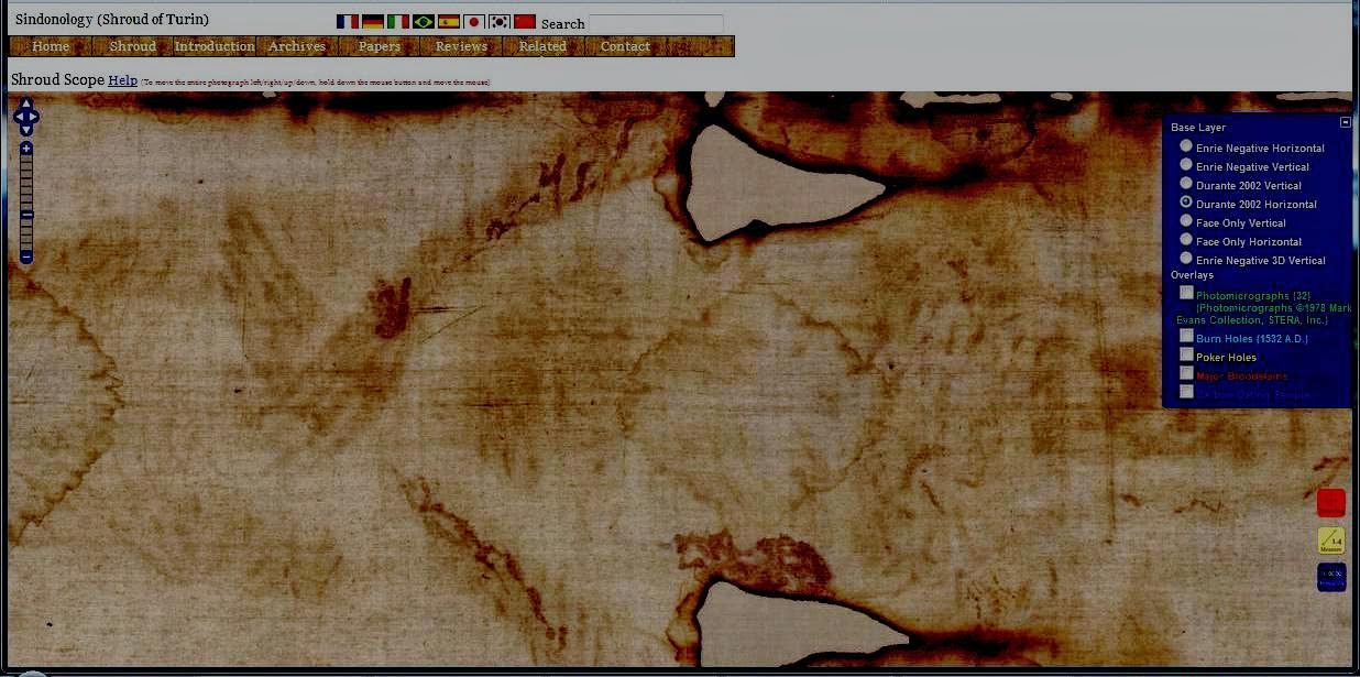
Here I've made a very small adjustment to the mid-tone value, from 60 down to 52, because it seemed to be optimising that crucial difference between the two colorations, on a location where it is possible to deduce where there is more or less easier contact between linen and flesh, e.g. backs of hands being a certainty, the region immediately around the hands much less certain. It is this kind of assessment where one compares colorations with known sites and their ease of access that gradually builds confidence that the colour differences are real (even if the absolute hues are not), and not trivial artefacts. I've also left the flags etc in the above picture, to show how little change there is after making these adjustments in Picture Manager.
Here's the Shroud Scope starter image for comparison:

I'll be back later with my interpretation of the two-tone effect. It was previously flagged up in my last-but-one posting, but the latter, being (admittedly) over-longit is now somewhat difficult to find. It won't hurt to repeat it here. Or there again, it may, conceivably just may, there being some folk in this fractious old world who don't care one bit for my anti-authenticity line. But have they been reading AND researching for nigh on three years? Well, I have, and there comes a time when one's thoughts start to crystallize. So why hold back? Tell folk what one really thinks. Don't beat about the bush.
Afterthought: so which image provided a better demonstration of two-tone properties. Was it the Halta Definizione picture off the BBC site:

or was it the comparable Shroud Scope picture in today's posting?

I'd say it was a close call, but one of them has the edge.
Postscript: have been scouring internet image files, searching for new TS images that can be 'tested' for two-tone character.
Here's a site that says its speciality is the TS for iPads.

So it seemed worth testing a portion of that image in Picture Manager, with no pre-set brightness, contrast etc, and merely vary settings to see if anything of interest emerged.

This shows quite well an effect noted in the previous posting - patchy greyish image area, distinct from orange-brown of the chin, nose etc, but present also outside the image area. It's as if there had been a coating on the linen, much of it probably now detached, that maybe served as a receptive layer for image, and given my focus on thermal imprinting, I'm bound to see it as some kind of mixture that gives a Maillard reaction when exposed to heat, say from a heated template. But the 'pointy' bits of the template will produce local over-heating, so one ends up with a heterogeneous image, with a diffuse background representing Maillard products, but with actual scorched linen at those high-pressure contact areas.
Let's not lose sight of the research imperative - never to place too much reliance on a single set of data, obtained with a particular set of variables. Previously I had demonstrated two-tone colour with an unfamiliar image, obtained off the Web, using particular settings in Office Manager. Today I've achieved a comparable result (perhaps not quite so striking) using the more familiar Shroud Scope image as input, and devising new settings from scratch. It seems fairly certain that the two-tone character is a real property of the TS image, one that has been curiously missed in the past. Why?
I was accused recently of working without a protocol. My defence (not that any defence is needed): independent researchers are free agents. They do not need protocols. Maybe it's those protocols, adhered to rigidly, that have prevented previous researchers doing what researchers do - experiment with new settings - just for the hell of it, to see what if anything happens.
News just in: there's a new Guardian feature devoted to Charles Freeman's article in 'History Today', setting out the historian's belief that the TS was created in medieval times for use in a religious festival.
It's accompanied by an image of the TS, provenance not specified. It looks good - like it were on real linen, but too good, being far more prominent that the real article in its glass case in Turin. Maybe it's one of those photographically-imprinted replicas one can buy. Irrespective, I thought it would be fun to upload that image to MS Picture Manager and see of I could give it a browner beard, nose, eyebrows etc.
Amazingly, the exercise was partially successful:
 |
| Before and after -21/100/7 brightness/contrast/mid-tone value |
But who says one needs to use a liquid? Why not a fine powder that can be rubbed into the surface of the linen, followed by thermal imprinting, then shaking out the surplus powder, hoping the browning products remain attached to the fabric?
Now then, what powder is likely to give a Maillard reaction with no further additions, and was a common commodity in medieval times?
The answer is obvious - WHITE FLOUR! Note the difference between using flour for a Maillard reaction, and Rogers' postulate regarding starch and its degradation products, The latter was presumed to be the source of reducing sugar (somewhat optimistically in my view, but no matter). The second component required is amino-groups, for which Rogers' saw a role for putrefaction amines released from a dead and (very quickly) decaying corpse. Flour on the other hand provides everything needed for a Maillard reaction. There are probably reducing sugars there already, and wheat flour is well supplied with albumin and glutenin proteins.
We shall see what we shall see...
That will be my next experiment.
This comment has just appeared elsewhere from Thibault Heimburger MD.
"... Regarding Colin, as I wrote, I do not understand him.
I wrote: ” …All of that being based on image manipulations.”This does not imply any kind of intellectual dishonesty.
Simply that he does not know/understand what he is doing while “manipulating” the images.".
Does TH know what's happening inside his patient's cells each time he prescribes an antibiotic or some other drug? No, and what's more he doesn't need to. What he does is monitor the outward symptoms, and look for changes that can be construed as improvements in the patients' condition. It's called intervention. It's what professionals do. They intervene.
Well, it's much the same where image enhancement is concerned. Does TH seriously imagine that the base images available say on Shroud Scope are sacrosanct? Indeed, does he imagine they are the 'authentic' representation of the TS image, when 1532 burn holes do not look like burn holes? Well, they do after I have made my very minor adjustments in contrast, brightness and mid-tone value (see how minor they are from my reference tablecloth photo above). No TH, I am NOT the innocent abroad you (or Dan Porter) make me out to be.
Friday 24 October
Afterthoughts: most investigators must perforce spend lengthy parts of their careers dealing with black box situations, even if pixel composition and RGB balance is not one of them. What is chemistry if not a black box? One cannot see what the individual atoms and molecules are doing, and would suffer instant sensory overload if one could. So one monitors changes at the macroscopic level instead - like physical state, colour, crystal form and melting temperature, chromatographic mobility etc etc and attempts to deduce what is happening at the ultramicroscopic level. The same goes for biology - one cannot see directly what is happening at the subcellular level - one monitors at the intact cell, tissue, organ or whole body level instead. Beware doomsters who say one is messing with things one does not understand, and can never hope to understand. Messing with things one does not understand has a name - it's called science. One CAN begin to understand, providing one's approach is systematic - changing variables one at a time, a little at a time, patiently building up one's knowledge base, getting a feel for the unfamiliar system, and losing no sleep through inability to see what's inside the black box.
I shall try my 'white flour' experiment today. But what if it all gets too complex? What if the flour particles introduce a new stochastic element, turning high-minded molecular chess into unpredictable snakes and ladders? What if one starts to see interruptions in the coloration along individual fibres, and/or phenomena that only image analysis experts can hope to understand, like, you know, striation, half tone effect, ultrasuperficiality etc etc? ;-)
08:30 As stated earlier, this blogger/experimentalist does not do protocol as part of his repertoire, but he does outline plan, and is happy to share that with readers ahead of doing his experiments (if only to scotch the silliness about my "manipulating" results). The buzz with science (see blog title) is to plump for a working model, and use it to make predictions. If the model's any good the predictions will prove correct. If not, the model may need to be modified or even abandoned. There is no shame in modifying a model. Hypothesis is not the same as set-in-concrete doctrine or dogma. When are folk going to learn the difference between the scientific modus operandi and apologetics?
From wiki: Apologetics (from Greek ἀπολογία, "speaking in defense") is the discipline of defending a position (often religious) through the systematic use of information.
Here's the plan for the flour experiment, displayed in three quickie stages with MS Paint:

Here we are all ready to go - with some unconventional "straight edges" in the field of view, of sentimental value to this now longish-in-the-tooth researcher (including that inconspicuous but precious little card that exempted me from the Vietnam-era Draft in 1970!)
Friday 12:50
We have a result, albeit preliminary from FLOUR TEST 1 (and a smelly kitchen too). There's a fulsome photographic record to go with it, as per usual.
I shall start writing it up this afternoon as a new posting. What title to give it? Talk up, or play down the result? One thing is for certain: I must desist from adding an exclamation mark to the end. Shroudologists (not counting radiocarbon daters) DETEST exclamation marks!

Technical Appendix
I shall be adding extra details here from time to time showing how a non-IT specialist without experience in image analysis can legitimately use photo-editing software as a research tool. All one has to do is to regard the software as a black box, to ring changes systematically, observing cause and effect, making constant use of known reference points to avoid artefacts. As stated elsewhere, chemists and cell biologists (including this retired biomedical scientist) spend most of their careers probing black boxes of one kind or another, given they cannot see the individual atoms or molecules, or what's happening inside living cells at the molecular level. I see Microsoft Office Picture Manager as just another black box, and will proceed to use the end of this posting to show the kind of checks I do before arriving at conclusions as to "what is really there" in the TS image.
Example 1: here are 'before and after' Halta Definizione images, where the edited version has been chosen initially because it looked scientifically "interesting", taking all things into consideration - the apparent difference between skin and hair, the similarity between hair and background, the enhancement of bloodstains etc.
But are these changes valid? Do they give any real insights into the starter image, or are they merely the product of chance?
In the next graphic I have shown just one particular route from start to end showing a smooth progression of changes. (I don't normally capture images en route, being content to operate slide controls as a quick visual check on the transition).
For the archive, here are the values for brightness/contrast/mid-tone in MS Office Picture Manager listed from start (0/0/0) to finish (30/50/-100) via the blue route:
0/0/0 ; 15/0/0 ; 0/50/0 ; 0/50/-20 ; 0/50/-40 ; 15/50/-80 ; 15/25/-100 ; 15/50/-100 ; 30/25/-80 ; 30/25/-100; 30/50/-100
Brief interpretation to follow, followed by a similar exercise for the complete frontal v dorsal images.
Briefly, there are some pictures that make particular points better than others. Thus if wanting to show that there are rose-coloured regions on the face that are distinct from the hair, I'd choose that last image (which was why it used earlier). But that is not necessarily the best picture for demonstrating that there is very little difference between head hair and non-image background - the difference being that one is more continuous (less patchy) than the other. Other pictures might be chosen to show blood to its best advantage etc etc. But the point is this: one is not totally reliant on any one picture to make a particular point. Most if not all pictures when enlarged show the particular point that is shown to best advantage in the chosen picture. One is NOT being fooled by chance artefacts (or trying to fool others). More importantly, even the "as is" image that was screen-grabbed from the BBC's site shows the two major observations of this exercise in image-analysis, namely (a) the presence of rose-coloured regions in some but not all parts of the body image and (b) the impression that the hair and background are not qualitatively different, and may be essentially one and the same composition, with one patchier than the other.
At the end of the day, the image analysis did not serve to arrive at hard-and-fast conclusions. What it did was to reinforce a growing impression, based on other lines of evidence, that the imaging of the TS was not directly onto linen but onto a coating substance (ring any bells?) capable of undergoing an in situ Maillard reaction to form orange-brown melanoidins. In other words, it served to generate a new hypothesis that had some scientific underpinning. One should not have to say it, but the decision to test out flour as the imprinting medium was not "cookery" based on testing out all the possible food or other ingredients from a medieval pantry. It was based on choosing a commonly available solid in fine powder form containing both reducing sugar and protein. Rogers' hypothetical starch or starch fractions did not fit the bill on at least one point, maybe two. Plain white flour on the other hand fitted both points, was easily testable AND gave a positive result, i.e. the ability to imprint negative images at temperatures that do not visibly affect untreated linen. What's more it worked on the very first test, eliciting a scarcely audible eureka with a diminutive e, but no champagne bottles are being cracked open just yet.
Moving on, here's a progression through the same brightness/contrast/mid-tone values of the Halta Definizione frontal body image. I've left off the red v blue route arrows - they run clockwise as before.
Which of these 11 images show artefacts that are not in the base image? I maintain there are none excluding the fairly minor differential coloration and saturation that assist with image interpretation, that may then be conducive to the framing and testing of new hypotheses (i.e. the uniquely quirky hit-and-miss 'scientific approach').
Here's the same progression for the dorsal image:
November 5
Here's a before and after comparison of the Halta face before and after 3D-rendering in Image J, with no prior fiddling with contrast, brightness controls etc. Even the faint image responds to 3D imaging. What price the claim that it's all that's left of a painted image that has flaked off?
Friday 24 October
Afterthoughts: most investigators must perforce spend lengthy parts of their careers dealing with black box situations, even if pixel composition and RGB balance is not one of them. What is chemistry if not a black box? One cannot see what the individual atoms and molecules are doing, and would suffer instant sensory overload if one could. So one monitors changes at the macroscopic level instead - like physical state, colour, crystal form and melting temperature, chromatographic mobility etc etc and attempts to deduce what is happening at the ultramicroscopic level. The same goes for biology - one cannot see directly what is happening at the subcellular level - one monitors at the intact cell, tissue, organ or whole body level instead. Beware doomsters who say one is messing with things one does not understand, and can never hope to understand. Messing with things one does not understand has a name - it's called science. One CAN begin to understand, providing one's approach is systematic - changing variables one at a time, a little at a time, patiently building up one's knowledge base, getting a feel for the unfamiliar system, and losing no sleep through inability to see what's inside the black box.
I shall try my 'white flour' experiment today. But what if it all gets too complex? What if the flour particles introduce a new stochastic element, turning high-minded molecular chess into unpredictable snakes and ladders? What if one starts to see interruptions in the coloration along individual fibres, and/or phenomena that only image analysis experts can hope to understand, like, you know, striation, half tone effect, ultrasuperficiality etc etc? ;-)
08:30 As stated earlier, this blogger/experimentalist does not do protocol as part of his repertoire, but he does outline plan, and is happy to share that with readers ahead of doing his experiments (if only to scotch the silliness about my "manipulating" results). The buzz with science (see blog title) is to plump for a working model, and use it to make predictions. If the model's any good the predictions will prove correct. If not, the model may need to be modified or even abandoned. There is no shame in modifying a model. Hypothesis is not the same as set-in-concrete doctrine or dogma. When are folk going to learn the difference between the scientific modus operandi and apologetics?
From wiki: Apologetics (from Greek ἀπολογία, "speaking in defense") is the discipline of defending a position (often religious) through the systematic use of information.
Here's the plan for the flour experiment, displayed in three quickie stages with MS Paint:
 | |
| Stage 1 (left)- place straight edge (grey) on linen, then sprinkle/lightly brush white wheaten flour along the boundary. |
Stage 2 (centre): remove straight edge.
Stage 3 (right): serially imprint with heated metal template, the latter cooling progressively when moved left to right in small jumps - see red arrow- along the line of demarcation between flour and untreated linen.
Here we are all ready to go - with some unconventional "straight edges" in the field of view, of sentimental value to this now longish-in-the-tooth researcher (including that inconspicuous but precious little card that exempted me from the Vietnam-era Draft in 1970!)
Friday 12:50
We have a result, albeit preliminary from FLOUR TEST 1 (and a smelly kitchen too). There's a fulsome photographic record to go with it, as per usual.
I shall start writing it up this afternoon as a new posting. What title to give it? Talk up, or play down the result? One thing is for certain: I must desist from adding an exclamation mark to the end. Shroudologists (not counting radiocarbon daters) DETEST exclamation marks!
Technical Appendix
I shall be adding extra details here from time to time showing how a non-IT specialist without experience in image analysis can legitimately use photo-editing software as a research tool. All one has to do is to regard the software as a black box, to ring changes systematically, observing cause and effect, making constant use of known reference points to avoid artefacts. As stated elsewhere, chemists and cell biologists (including this retired biomedical scientist) spend most of their careers probing black boxes of one kind or another, given they cannot see the individual atoms or molecules, or what's happening inside living cells at the molecular level. I see Microsoft Office Picture Manager as just another black box, and will proceed to use the end of this posting to show the kind of checks I do before arriving at conclusions as to "what is really there" in the TS image.
Example 1: here are 'before and after' Halta Definizione images, where the edited version has been chosen initially because it looked scientifically "interesting", taking all things into consideration - the apparent difference between skin and hair, the similarity between hair and background, the enhancement of bloodstains etc.
 |
| Left - Image' as is' on the BBC site. Right - after applying Brightness (30); Contrast (50); Mid-tone value (-100) in MS Office Picture Manager |
But are these changes valid? Do they give any real insights into the starter image, or are they merely the product of chance?
In the next graphic I have shown just one particular route from start to end showing a smooth progression of changes. (I don't normally capture images en route, being content to operate slide controls as a quick visual check on the transition).
 |
| Direct route (red arrow) v stepwise progression (blue route). Click to ENLARGE. |
For the archive, here are the values for brightness/contrast/mid-tone in MS Office Picture Manager listed from start (0/0/0) to finish (30/50/-100) via the blue route:
0/0/0 ; 15/0/0 ; 0/50/0 ; 0/50/-20 ; 0/50/-40 ; 15/50/-80 ; 15/25/-100 ; 15/50/-100 ; 30/25/-80 ; 30/25/-100; 30/50/-100
Brief interpretation to follow, followed by a similar exercise for the complete frontal v dorsal images.
Briefly, there are some pictures that make particular points better than others. Thus if wanting to show that there are rose-coloured regions on the face that are distinct from the hair, I'd choose that last image (which was why it used earlier). But that is not necessarily the best picture for demonstrating that there is very little difference between head hair and non-image background - the difference being that one is more continuous (less patchy) than the other. Other pictures might be chosen to show blood to its best advantage etc etc. But the point is this: one is not totally reliant on any one picture to make a particular point. Most if not all pictures when enlarged show the particular point that is shown to best advantage in the chosen picture. One is NOT being fooled by chance artefacts (or trying to fool others). More importantly, even the "as is" image that was screen-grabbed from the BBC's site shows the two major observations of this exercise in image-analysis, namely (a) the presence of rose-coloured regions in some but not all parts of the body image and (b) the impression that the hair and background are not qualitatively different, and may be essentially one and the same composition, with one patchier than the other.
At the end of the day, the image analysis did not serve to arrive at hard-and-fast conclusions. What it did was to reinforce a growing impression, based on other lines of evidence, that the imaging of the TS was not directly onto linen but onto a coating substance (ring any bells?) capable of undergoing an in situ Maillard reaction to form orange-brown melanoidins. In other words, it served to generate a new hypothesis that had some scientific underpinning. One should not have to say it, but the decision to test out flour as the imprinting medium was not "cookery" based on testing out all the possible food or other ingredients from a medieval pantry. It was based on choosing a commonly available solid in fine powder form containing both reducing sugar and protein. Rogers' hypothetical starch or starch fractions did not fit the bill on at least one point, maybe two. Plain white flour on the other hand fitted both points, was easily testable AND gave a positive result, i.e. the ability to imprint negative images at temperatures that do not visibly affect untreated linen. What's more it worked on the very first test, eliciting a scarcely audible eureka with a diminutive e, but no champagne bottles are being cracked open just yet.
Moving on, here's a progression through the same brightness/contrast/mid-tone values of the Halta Definizione frontal body image. I've left off the red v blue route arrows - they run clockwise as before.
 |
| Click to ENLARGE |
Which of these 11 images show artefacts that are not in the base image? I maintain there are none excluding the fairly minor differential coloration and saturation that assist with image interpretation, that may then be conducive to the framing and testing of new hypotheses (i.e. the uniquely quirky hit-and-miss 'scientific approach').
Here's the same progression for the dorsal image:
 |
| Click to ENLARGE |
Here's a before and after comparison of the Halta face before and after 3D-rendering in Image J, with no prior fiddling with contrast, brightness controls etc. Even the faint image responds to 3D imaging. What price the claim that it's all that's left of a painted image that has flaked off?
 |
| Halta Definizione Shroud image, 'as is' from BBC site, before and after 3D rendering in ImageJ |