This site is somewhat past its sell-by-date now as far as the Shroud is concerned - and needs re-writing anyway. Those who are only here for the Shroud should click on the link above.)
Further update December 2014: I see this posting still gets a sizeable number of hits, so it's as well to point out that this site is once again my major one for any and all science-related topics, the Turin Shroud included, and has been since March this year. In other words, the title of this posting is no longer valid!
Original posting
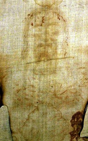
Let's start with some cut-and-paste from one of Dan Porter's sites. There is a graphic and an excellent account of what it shows (and, more to the point, does not show):

Computerised representation of the Shroud image with 3D enhancement
"Look at a full frontal picture of a man. The tip of his nose approaches white and the depth of the recesses of his eyes are darker. The roundness of his face from his cheeks towards his ears is progressively darker. At first glance, the face on the Shroud of Turin appears to be such a picture. It isn't.
How do we know this? All regular pictures, be they paintings or photographs, represent light coming from some direction and being reflected towards our eyes. The eye of the painter or the camera lens is a proxy for our own eyes. The reason the recesses of a man's eyes are darker than the tip of his nose is because less light gets to into the recess. Image analysis shows us that this is not so with the facial image on the Shroud. There is no direction to what seems like light. Something else is causing the lighter and darker shades. That is looks like light to us is an optical illusion.
... with special computer software we can plot the data, the brighter and darker tones, as an elevation. That is exactly what we can do with the image on the Shroud of Turin: plot it as an elevation.
Let's be clear: You can not plot a regular photograph this way. Nor can you do so for a painting, even a brown and white painting. You can do so with a precise copy of the Shroud, however.
Not only does this show that the image on the Shroud is not a photograph or painting, it shows that something extraordinary occurred to form the image".
***********************************************************************************
I shall return later and suggest how the original Shroud image was produced, and why it gave rise to the peculiar pattern of light and dark that we see in the green computer-enhanced image above:
First, let's go to the original introduction to this post:
They say a picture is worth a thousand words. Well, here are two pictures that I consider make it 99% certain that the Shroud of Turin is a medieval fake. You may need to consult some of my previous posts on the subject - some 20 in all - to appreciate the background - which relate an accumulation of steadily growing evidence from simple kitchen experiments - but I shan't clutter up this final post with a lot of verbiage - the pictures tell all.
The first is a picture of a small metal trinket I brought back from Ghana, which I heated over a cooker ring, then thrust face down into a sheet of linen placed over a tray of sand. It shows the scorch mark left by the artefact.
The second is a picture I took after just 30 minutes of playing with an unfamiliar bit of software, one which anyone can download off the internet - which converts 2D images to 3D representations.

3D metal object with scorch mark left on linen

From 2D scorch mark (previous picture) to 3D visualisation
(This was my very first experiment with the software - if you feel like further tweaking then I will provide a link to the free software)
NEW ADDITON: I WAS ASKED ELSEWHERE IF THE SAME 3D EFFECT WAS OBTAINABLE WITH A FAINTER IMAGE. THE ANSWER IS YES!


Take your pick from the 20th century photo album of computerised reprocessing of the Shroud image
What a wonderful thing is this modern computer imaging technology - able to enhance in glorious 3D a supposedly first century AD image of the crucified Christ. What's more, it was captured, would you believe it, on his burial shroud in his tomb, at the very instant of Resurrection, by a mysterious flash of light - or even uv or x-rays - according to some Shroud scientists?
Nuff said methinks. I shall use the Comments sections to add, or clarify, or respond to reasonable criticism. Message to internet trolls: please don't waste your time - or mine - since abuse will neither be tolerated nor published.
sciencebod aka newsjunkie aka ColinB
Colin Berry MSc PhD (Biochemistry)
emails to: sciencebod01@aol.com
Postscript: arising from comments, another test for my model has come to mind, but it's a little involved. Are you sitting comfortable? OK, I shall begin:
Suppose one took a bust of a person and chose, let's say, 50 points at random, and then, with the aid of camera and computer, converted the image to a relief map, showing contour lines linking points at the same height above a reference line.Suppose one then put that data into a 3D image analyser to produce the kind of image obtained for the Man on the Shroud? How closely would they compare? Is the Shroud image really a relief map based on elevation? I don't think it is, so here's what I propose. Take the same bust, and at each of the 50 points that were selected for relief mapping attach a sensitive electronic pressure monitor. Then push the bust with attached monitors into linen/sand and get a pressure reading for each of the 50 points. That can then be used to plot "isobars", i.e. lines joining points of equal pressure. Then analyse that image for 3D properties. It's my guess that "pressure" map would give a better match to the Shroud image than one based on supposed elevation.
Here's another perhaps simpler way of looking at it. The most intense scorch mark in my sand bed model is not necessarily from points that are highest, e.g. the nose but from points that present square-on to the sand when one presses in, giving the greatest pressure, the closest contact between linen and hot metal, the greatest intensity of scorching..
Look at the Shroud image again. Am I not right in thinking that it is the flattest parts that give the greatest image density, regardless of elevation? That is why those closed eyes are so prominent, despite being relatively low. That is why one does not see the sides of the face, not because they are particularly low in elevation terms, but because they offer little or no resistance to the linen/sand.
I believe the Shroud image should be re-scanned to see whether it fits a relief model better or worse than one based on angle of plane surface relative to an applied force. (I'm aware there may be potential cans of worms in making this comparison, but it seems at least worth flagging up the idea now).
Something else to consider: Others, e.g. the Bad Archaeology site, have pointed out that the image is "anatomically impossible", that for example "neck is too long". There is a simple explanation for that in my sand bed model. When the metal effigy (bronze statue or whatever) is pushed into the linen/sand the cloth is first pressed against the "square on" features of the face, and then turns a right angle at the end of the chin, when it is then pressed lightly against the underside of the chin before it hits the next plane square-on surface, i.e. the neck.

Note the two crease marks at the chin and just below. One is dark, the other light, suggesting the cloth is folded in opposite directions, as might be expected if forced to change directions twice.
But here's the crucial point: when the linen is then removed and laid flat, the neck will look too long because the top portion represents the underside of the chin, which can be a considerable length (it is about 10 cm on both me and the missus.)
Oops. I said I would attempt to explain the peculiar 3D image (green) at the top of the page. OK, here we go. Observe closely where there is shade. The shade is under the eyebrows, under the eyelids, under the nose, under the lips etc. It's almost as it there had been a source of light above the face that had cast into shadow any feature that was beneath an "overhang", no matter how small. Well, once could suggest thatthe face is an image in the harsh glare of an overhead light, captured by some kind of photography, but I do not believe photography had any role to play, and (curiously) those who think the image is in some way or another miraculous have failed to comment on the "top-lighting" effect.
Here's my explanation: all the shaded regions represent parts of the face on a 3D replica, e.g. bronze replica of the crucified Christ that would not be able to compress the linen onto the sandbed, due to being in a plane that is vertical to the one that gives compression. Consider the nose: a small part of the bridge of the nose, pressed into linen/sand, would encounter resistance as the sand is compressed, and would leave a branded imprint. But the underside of the nose, with the nostrils would not. The sides of the nose, being slightly angled, would leave a small imprint, but not a major one.
It is time that the Shroud image was thoroughly re-examined to see if the image density corresponds to my sand bed theory, and is a mapping of contours in relation to compaction pressure, and with it the degree of close contact between hot metal and linen to result in differering degrees of heat-scorching.
So much then for the Turin Shroud where this site is concerned. I have created (Feb 2012) a new WordPress blog that will report any further results and ideas I may have on the subject:
Spotlight on that Shroud of Turin Without All The Hype